BrandingEco brand
Brand identity for an eco brand
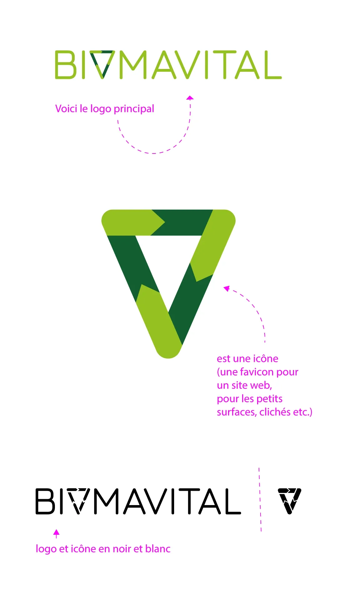
Logo, icon, colours, typefaces and materials for a brand whose slogan reads “Guardians of nature, not its owners”.
Challenge
Create a recognisable mark that works both inside the logo and on its own — as a favicon, a stamp or on merch.
Solution
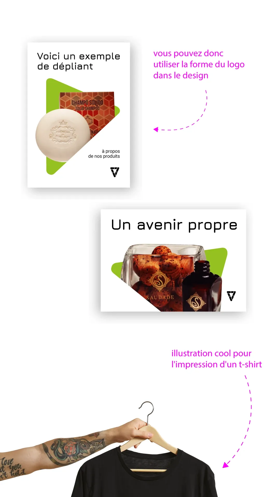
- A triangle mark made of arrows — a symbol of the cycle, built into the name instead of the letter “O”.
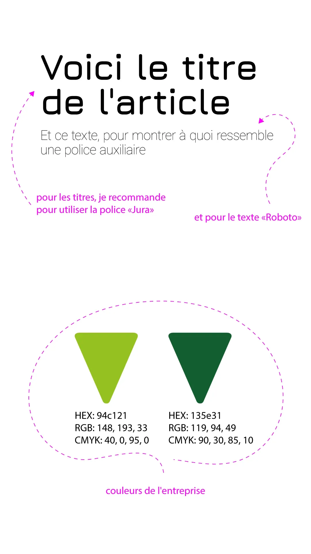
- Two brand greens, Jura and Roboto typefaces, black-and-white versions of the logo and icon.
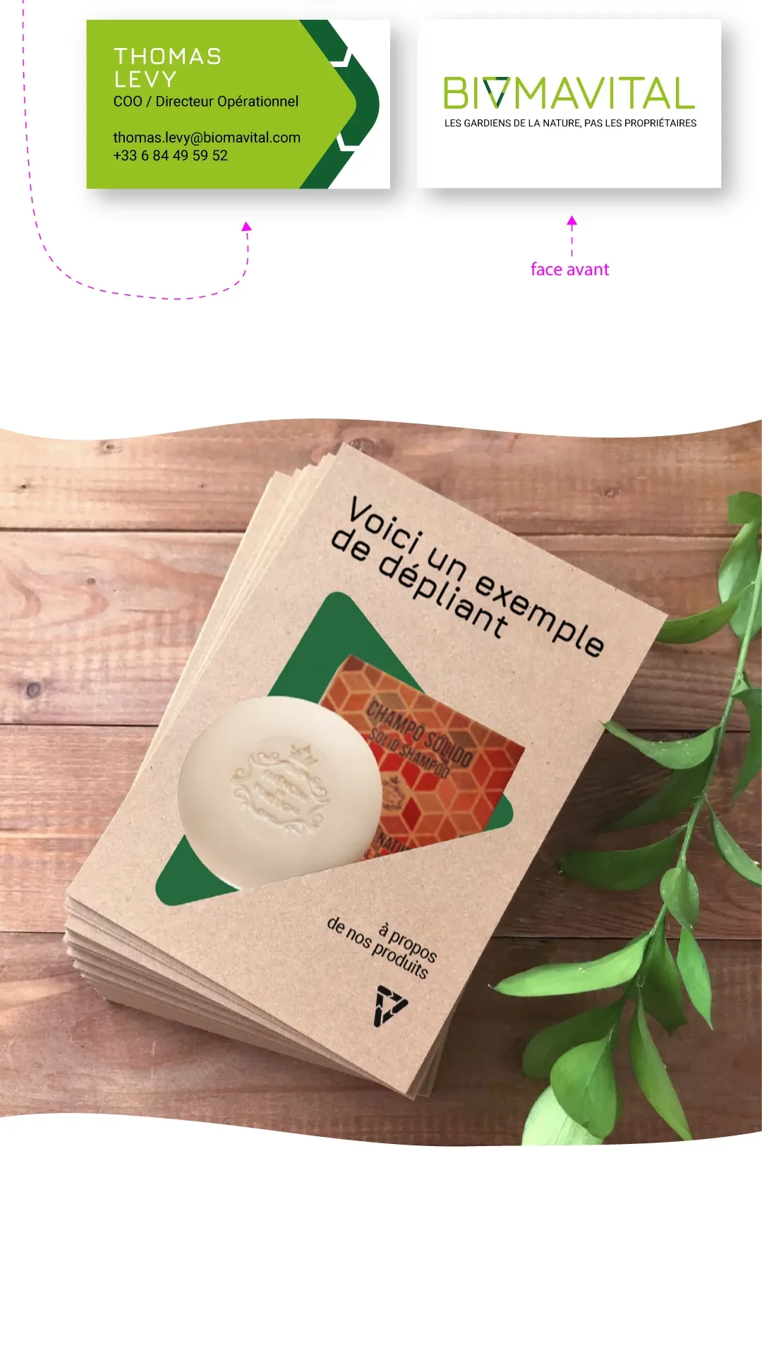
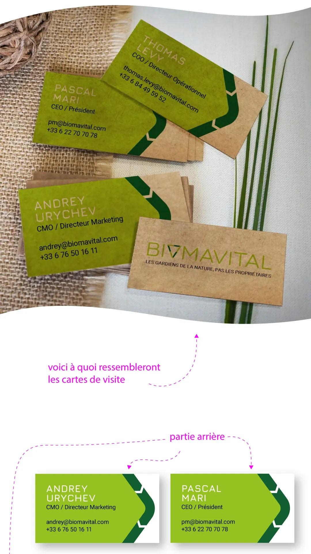
- Business cards, a flyer on kraft paper and a T-shirt print.
Result
We only publish confirmed results. Figures will appear once the client approves their publication.
Project gallery
Got a similar task?
Tell us about it. Or pass us a client project through the partner programme.
Next case
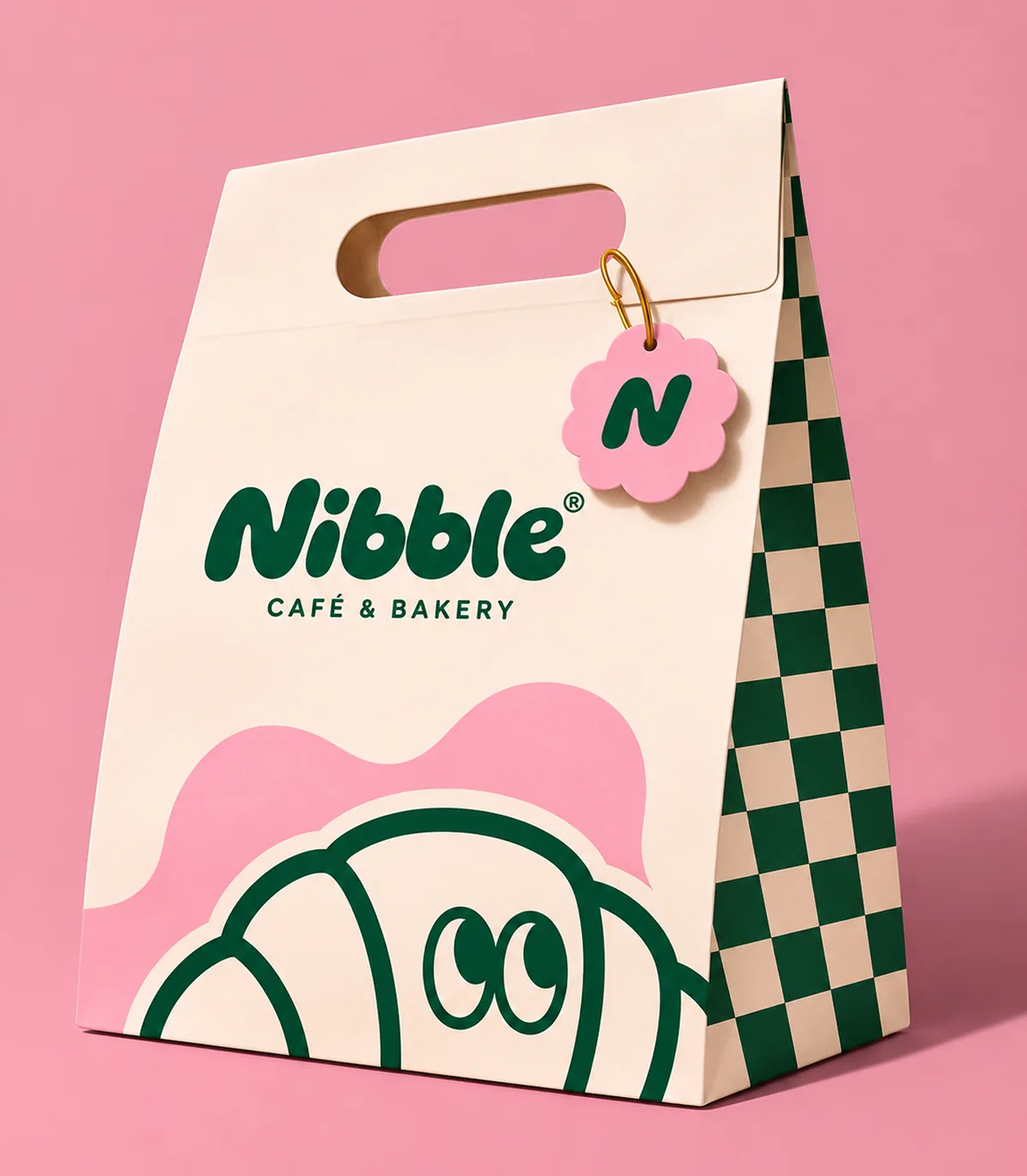
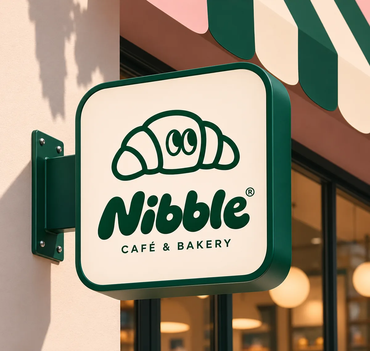
BrandingCafés & bakeries
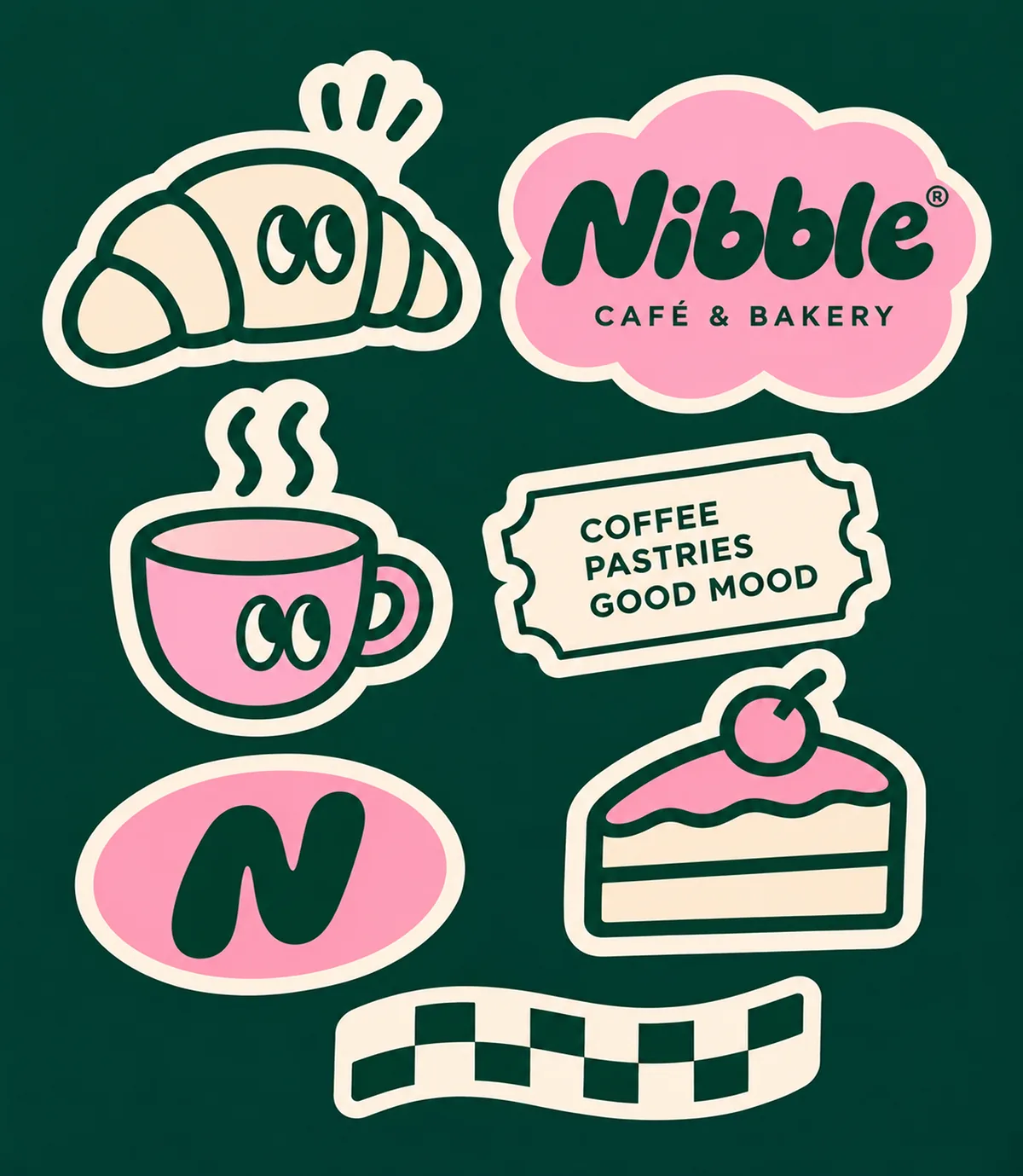
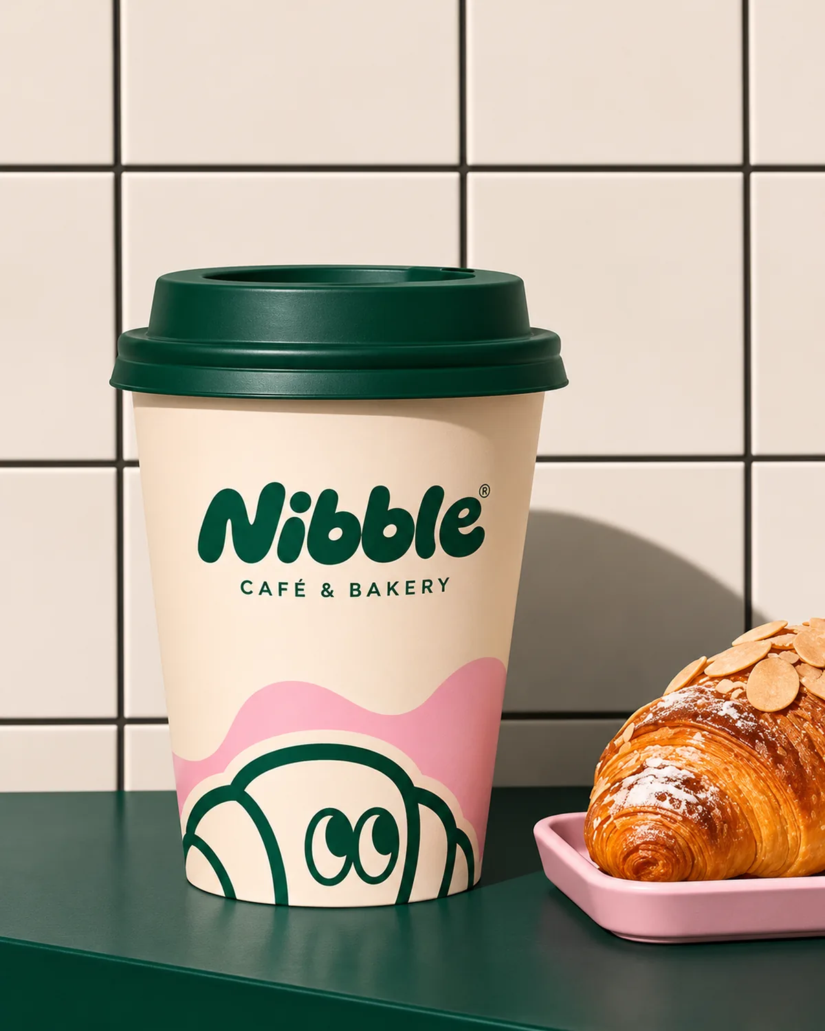
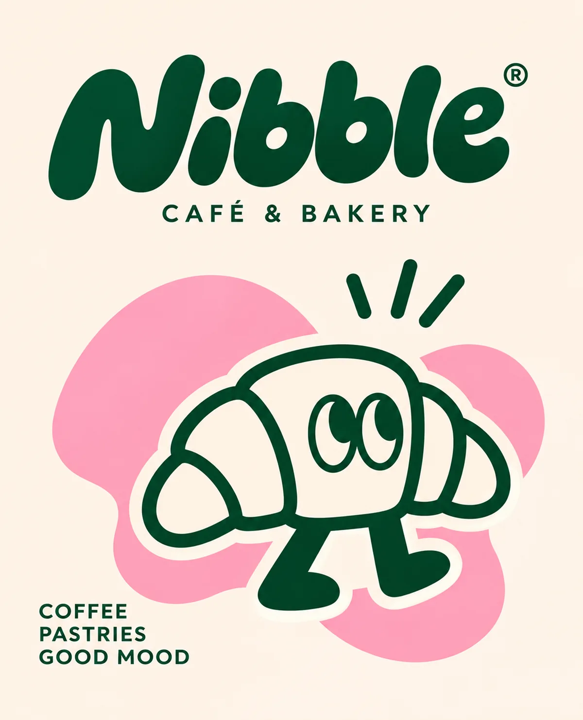
Logo, a croissant mascot, a sticker pack and brand materials for a café & bakery with the slogan “Coffee, pastries, good mood”.
- Logo
- Visual identity
- Mascot
- Packaging